There comes a time in most developersʼ lives when they think to themselves: “I should rebuild my personal website and start a new blog.” As far as I can tell this is a symptom of some kind of minor mental illness, delusion, or narcisistic tendency. Itʼs almost always a bad idea, a distraction from more important work, and most likely to be doomed to stagnate. I donʼt expect this time to end up any different but I had fun dammit and want to share a little bit about what I learned.
A couple weeks ago while on parental leave I felt the itch to step beyond Medium, use the opportunity to pick up some new technologies Iʼve been meaning to learn, and try to make something delightful. I definitely had better things to do, so this was a bit of active procrastination. But you know what? I donʼt feel bad about that at all. Only working on whatʼs important is like only eating your vegetables and keeping to your daily exercise. A break from routine or an indulgent snack can light up the mind and spark creative inspiration. As Iʼm wrapping this up and returning to more important projects I have renewed energy and new ideas.
Feeding your creativity requires occasionally giving in to scratch the itch; to eat your snacks. Practice snack driven development.
This particular snack was a filling one. I learned a lot I could talk about including JAMStack, serverless, Next.js, Vercel, Fauna DB, Lighthouse, Puppeteer, and more. As an even clearer sign of delusion, if I was going to give up Medium then I was determined to make something even better. So Iʼd love to talk about one particular detail where I think I came close to that unreasonable goal: giving feedback.
A universe of feedback interfaces§
Iʼve always been fascinated by feedback interfaces. In 2008 I joined Facebook as a Product Designer while the Like button was under development. At the time it wasnʼt clear how social feedback should work. Lots of wild prototypes and internal debate over years finally led to the “Awesome” button launching renamed “Like.” It was enlightening to watch that design process and the following ten years have seen even more experimentation and innovation in giving feedback and appreciation.
While thinking about how I wanted to approach feedback for my own blog, I decided to take a look at some of the wide variation in feedback interfaces and figure out how I could borrow ideas and try to make something novel, fun, and that felt right for the content and audience of a personal blog.
Emoji Reactions§

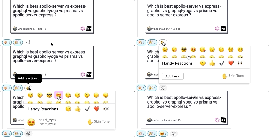
I use Slack at work every day. We take our emoji reactions seriously. Sometimes you just need that mood. It feels right for a tight-knit team and on ours we welcome every new teammate with a custom emoji. But its a bit complicated with emoji pickers and typeaheads, popovers with lists of people, and image uploading forms. Too fiddly for a blog.

Facebookʼs own evolution of the like button, reactions, is comparatively much simpler while still keeping most of the delight, but is better suited to be used alongside a huge range of unknown content which might elicit any in the full gamut of emotional responses. Maybe not the best fit for blog articles.
Kudos§

When Svbtle was first presented it brought with it a peculiar feedback mechanism called “Kudos” that while clearly inspired by the Like button also took a step beyond. You donʼt click this button but instead hover over it and “donʼt move,” a clever subversion of expectations that evokes just enough suspense to have a satisfying payoff.
Yet I canʼt help but feel disappointed in what Kudos could have become. The black-and-white-concentrics vibe is minimal to the point of lacking any personality. Thereʼs no way to revoke your feedback which seems like a hoodwink. It translates poorly to mobile where you need to press and hold (more work than a regular button) and not at all to accessiblity software.
Applause§

Credit to Mediumʼs product designers for a number of accomplishments with their feedback interface. First of all, giving “Applause” feels more appropriate than a “Like” or other reaction for published content. Then thereʼs the innovation of allowing as many claps as you like, which offers a surprising range of expressiveness from golf-clap to standing ovation. I speculate this also results in a bigger dopamine hit from the “make the number go up” game of social media, especially since it has a perfectly celebratory animation.
While probably my favorite of the bunch, Mediumʼs feedback interface still has its drawbacks. While applause is fitting for articles its also impersonal. Giving more than one clap isnʼt very discoverable, requiring you to click and hold which is not something the webfaring mouse finds itself doing regularly and can fight with native behavior, especially on Mobile devices.
Introducing Snacks!§

So how should I go about feedback? Throw a bit of all of these ideas into the idea cauldron! I hoped to take the best of this evolution of feedback interfaces, inject a little personality, and deliver something delightful and subjectively appropriate for my own personal blog.
Like Slack and other Emoji interfaces, thereʼs a sense of leaving something specific behind. Rather than just tally another number on the stack of likes, how about you leave me a snack?
Like Kudos, thereʼs an interaction model that feels fun but carries over to mobile.
Like Medium, you can leave as few or as many snacks as you feel, however each number of snacks is represented by a different delicious emoji.
Overall, Iʼm quite pleased with the result. Building this new personal site and this new feedback mechanism was a delicious mental snack. I freely admit it was a distraction from valuable nutritious work, but sometimes you just need a snack.
So why donʼt you leave me one?